基础
CSS 规则由两个主要的部分构成:选择器,以及一条或多条声明:
CSS声明总是以分号 ; 结束,声明总以大括号 {} 括起来:
CSS注释以 /* 开始, 以 */ 结束, 实例如下:
一般情况下,优先级如下,高级会覆盖低级:
(内联样式)Inline style > (内部样式)Internal style sheet >(外部样式)External style sheet > 浏览器默认样式
1
2
3
4
5
6
7
8
9
10
11
12
13
14
15
16
17
18
19
20
21
22
23
24
| <!DOCTYPE html>
<html lang="en">
<head>
<meta charset="UTF-8">
<meta name="viewport" content="width=device-width, initial-scale=1.0">
<title>CSS导入方式</title>
<link rel="stylesheet" href="style1.css">
<style>
p{
color:red;
font-size: 26px;
}
h2{
color: green;
}
</style>
</head>
<body>
<p>这是一个段落</p>
<h1 style="color: blue;">这是第一个标题,用了内联样式</h1>
<h2>这是第二个标题,用了内部样式</h2>
<h3>这是第三个标题,用了外部样式</h3>
</body>
</html>
|
选择器
1.元素(标签)选择器
div、p —— 选中同名标签的所有元素。
2.类选择器
.class —— 选中带该类名的元素。可链式:.card.primary。
3.ID 选择器
#id —— 选中具有该 id 的唯一元素(页面里应唯一)。
4.通配(万能)选择器
*—— 匹配任意元素,常用于重置样式或与属性选择器组合。
5.子代(直接子元素)选择器
.parent > .child —— 只匹配直接子元素。
6.后代选择器
.parent .descendant —— 匹配任意层级的后代。
7.相邻兄弟选择器
A + B —— 选择紧跟在 A 后面的同级元素 B(只影响后面的一个)。
8.通用兄弟选择器
A ~ B —— 选择 A 之后的所有同级 B。
9.伪类选择器(状态/结构)
交互::hover(鼠标放在上面时)、:focus、:active、:visited、:link
结构::first-child、:last-child、:nth-child(n)、:first-of-type 等
注::first-child 是第一个子元素,而 :first-of-type 是同类型中的第一个。
10.伪元素选择器
::before、::after、::first-line 等 —— 选择元素的虚拟部分。
现代写法用双冒号 ::。
1
2
3
4
5
6
7
8
9
10
11
12
13
14
15
16
17
18
19
20
21
22
23
24
25
26
27
28
29
30
31
32
33
34
35
36
37
38
39
40
41
42
43
44
45
46
47
48
49
50
51
52
53
54
55
56
57
58
59
60
61
62
63
64
| <!DOCTYPE html>
<html lang="zh-CN">
<head>
<meta charset="UTF-8">
<meta name="viewport" content="width=device-width, initial-scale=1.0">
<title>选择器</title>
<style>
h1 {
color: blue;
}
.highlight {
color: green;
}
#unique {
color: red;
}
* {
font-family: 'kaiTi';
}
.father > .son {
color: orange;
}
.father p {
color: purple;
font-size: larger;
}
h4 + p {
background-color: yellow;
}
#element:hover {
background-color: brown;
}
</style>
</head>
<body>
<h1>元素选择器</h1>
<h2 class="highlight">类选择器 </h2>
<h2>另一个类选择器</h2>
<h3 id="unique">ID选择器</h3>
<div class="father">
<p class="son">这是一个子元素选择器</p>
<div>
<p class="grandson">这是一个后代选择器</p>
</div>
</div>
<p>前段落</p>
<h4>相邻兄弟选择器</h4>
<p>后段落</p>
<h5 id="element">伪类选择器</h5>
<h5>对比</h5>
</body>
</html>
|
区块
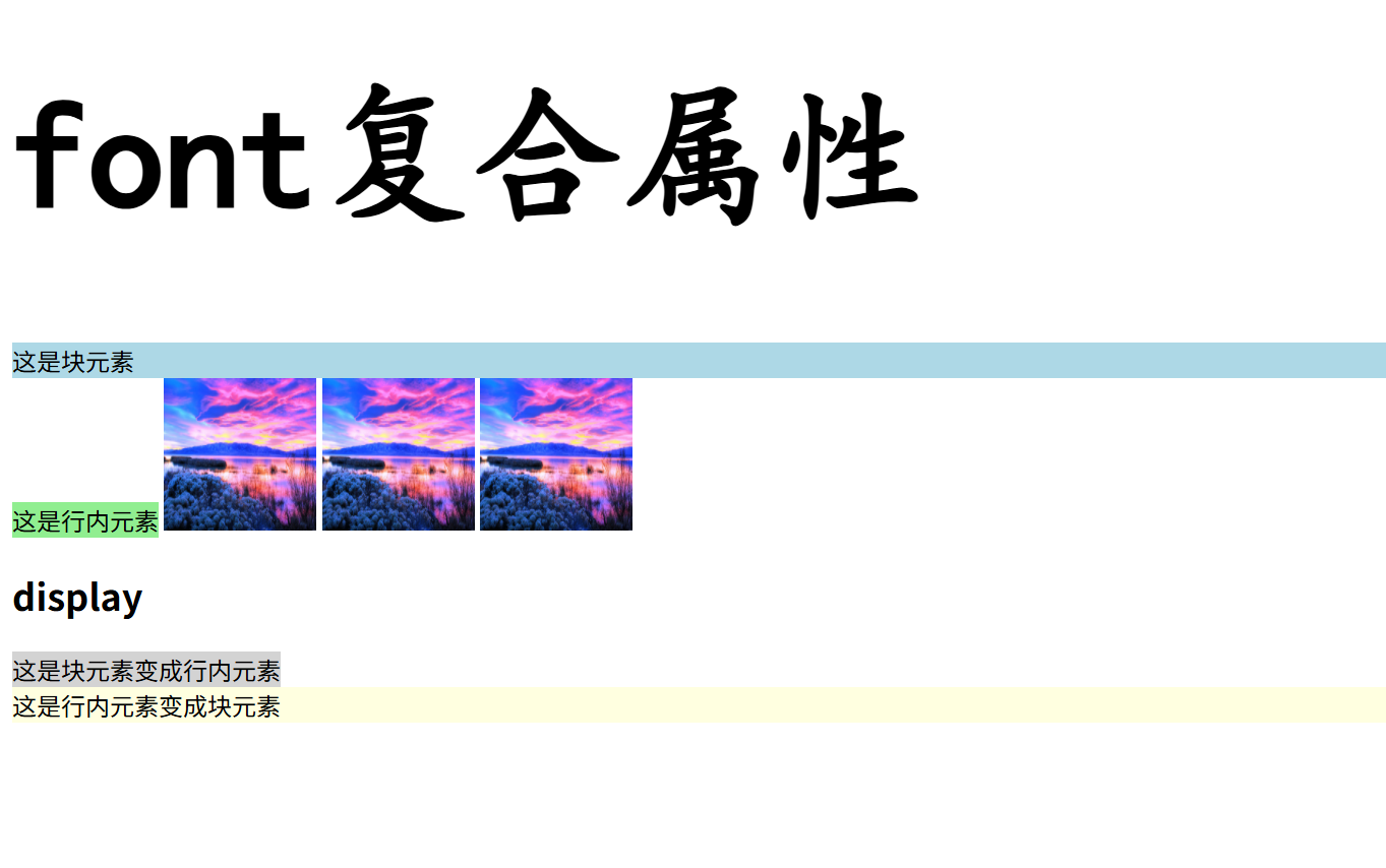
块元素:独占一行,默认宽度100%,可设置宽高和完整盒模型(margin/padding/border全方向生效),能包含块级和行内元素,常见如div、p、h1。
行内元素:同行显示,宽高由内容决定不可直接设置,垂直方向margin/padding不推挤布局,只能包含文本或其他行内元素,常见如span、a、strong。
行内块元素:同行显示但可独立设置宽高,拥有完整盒模型(margin/padding/border全方向生效),能包含任意元素,通过display:inline-block实现,常见如img、input。
(font时复合属性,可以一次性部署多个样式,即可以输出字体属性,*font: [加粗] [字号] [行高] [家族];*)
1
2
3
4
5
6
7
8
9
10
11
12
13
14
15
16
17
18
19
20
21
22
23
24
25
26
27
28
29
30
31
32
33
34
35
36
37
38
39
40
| <!DOCTYPE html>
<html lang="zh-CN">
<head>
<meta charset="UTF-8">
<meta name="viewport" content="width=device-width, initial-scale=1.0">
<title>区块</title>
<style>
.block {
background-color: lightblue;
}
.inline {
background-color: lightgreen;
}
.inline-block {
background-color: lightcoral;
width: 100px;
height: 100px;
}
.div-to-inline {
display: inline;
background-color: lightgray;
}
.inline-to-block {
display: block;
background-color: lightyellow;
}
</style>
</head>
<body>
<h1 style="font: bold 100px 'KaiTi';">font复合属性</h1>
<div class="block">这是块元素</div>
<span class="inline">这是行内元素</span>
<img src="R.jpg" alt="图片" class="inline-block">
<img src="R.jpg" alt="图片" class="inline-block">
<img src="R.jpg" alt="图片" class="inline-block">
<h2>display</h2>
<div class="div-to-inline">这是块元素变成行内元素</div>
<span class="inline-to-block">这是行内元素变成块元素</span>
</body>
</html>
|
盒子模型
CSS 盒模型本质上是一个盒子,封装周围的 HTML 元素,它包括:边距,边框,填充,和实际内容。
盒模型允许我们在其它元素和周围元素边框之间的空间放置元素。
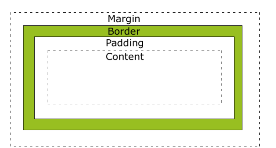
- Margin(外边距) - 清除边框区域。Margin 没有背景颜色,它是完全透明
- Border(边框) - 边框周围的填充和内容。边框是受到盒子的背景颜色影响
- Padding(内边距) - 清除内容周围的区域。会受到框中填充的背景颜色影响
- Content(内容) - 盒子的内容,显示文本和图像
text-align: center; /* 文字水平居中 /
line-height: 内容区高度; /* 文字垂直居中 */
| 盒子区域 |
CSS 属性 |
作用 |
| 内容区域 |
width/height |
显示文字/图片的实际区域 |
| 内边距 |
padding |
内容与边框之间的透明区域 |
| 边框 |
border-* |
围绕内边距的装饰边框 |
| 外边距 |
margin |
盒子与其他元素的透明间隔 |
1
2
3
4
5
6
7
8
9
10
11
12
13
14
15
16
17
18
19
20
21
22
23
24
25
26
27
28
29
30
31
32
| <!DOCTYPE html>
<html lang="zh-CN">
<head>
<meta charset="UTF-8">
<meta name="viewport" content="width=device-width, initial-scale=1.0">
<title>盒子模型</title>
<style>
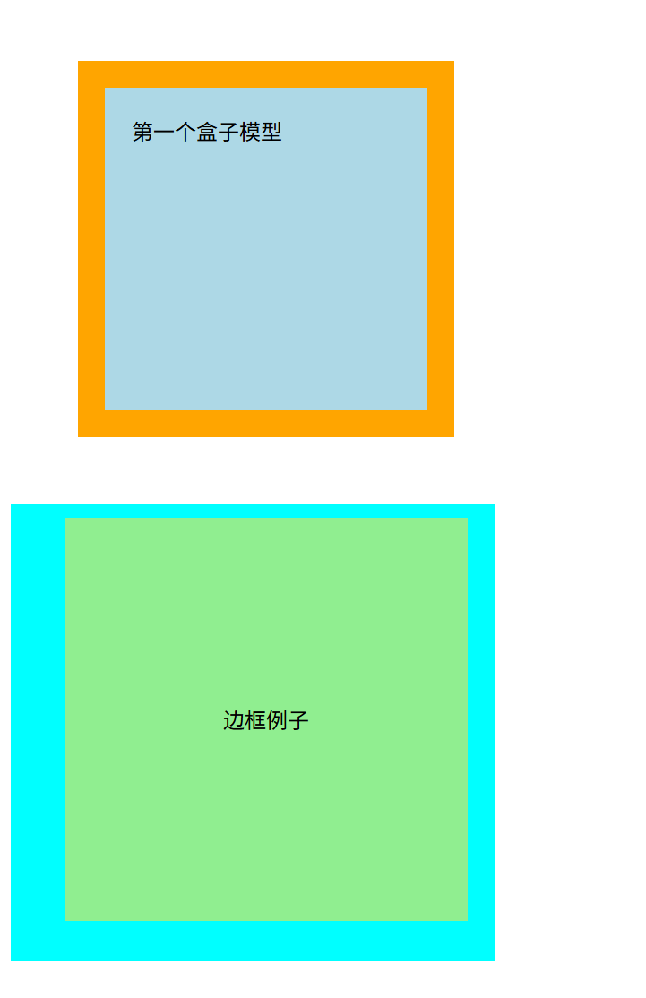
.demo {
background-color: lightblue;
width: 200px;
height: 200px;
border: 20px solid orange;
padding: 20px;
margin: 50px;
}
.border {
background-color: lightgreen;
width: 300px;
height: 300px;
border-color: aqua;
border-style: solid;
border-width: 10px 20px 30px 40px;
text-align: center;
line-height: 300px;
}
</style>
</head>
<body>
<div class="demo">第一个盒子模型</div>
<div class="border">边框例子</div>
</body>
</html>
|
flex盒子
Flexbox(弹性盒布局)是一种一维布局方式:把父元素设为 display:flex 后,子项会沿着“主轴”排布,并能按剩余空间伸缩,还能在主轴/交叉轴上对齐。
- Flex 容器:设了
display: flex|inline-flex 的父元素。
- Flex 子项:容器里的直接子元素。
- 主轴 / 交叉轴:由
flex-direction 决定(row=水平为主轴,column=垂直为主轴)。
- 起始/结束边:
flex-start / flex-end 对应主轴或交叉轴的两端。
- 多行:
flex-wrap: wrap 时产生多条 flex line,此时才用得上 align-content。
| 属性 |
示例 |
作用 |
| flex: |
1 ⇒ 1 1 0 |
允许增长,按比例占剩余空间 |
|
2 ⇒ 2 1 0 |
与其它可增长项按“2”的权重分空间 |
|
0 0 200px |
不长不缩,基准宽 200px(常做固定列) |
浮动
CSS float 属性定义元素在哪个方向浮动,浮动元素会生成一个块级框,直到该块级框的外边缘碰到包含框或者其他的浮动框为止。
元素的水平方向浮动,意味着元素只能左右移动而不能上下移动。如果有空间的话,它们将彼此相邻
(注意:浮动中标准页面布局将不适用)
1
2
3
4
5
6
7
8
9
10
11
12
13
14
15
16
17
18
19
20
21
22
23
24
25
26
27
28
29
30
31
32
33
| <!DOCTYPE html>
<html lang="zh-CN">
<head>
<meta charset="UTF-8">
<meta name="viewport" content="width=device-width, initial-scale=1.0">
<title>浮动示例</title>
<style>
.father {
background-color: yellow;
border: 2px solid black;
overflow: hidden;
}
.left{
width: 50px;
height: 50px;
background-color: red;
float: left;
}
.right{
width: 50px;
height: 50px;
background-color: blue;
float: right;
}
</style>
</head>
<body>
<div class="father">
<div class="left">左侧浮动</div>
<div class="right">右侧浮动</div>
</div>
</body>
</html>
|

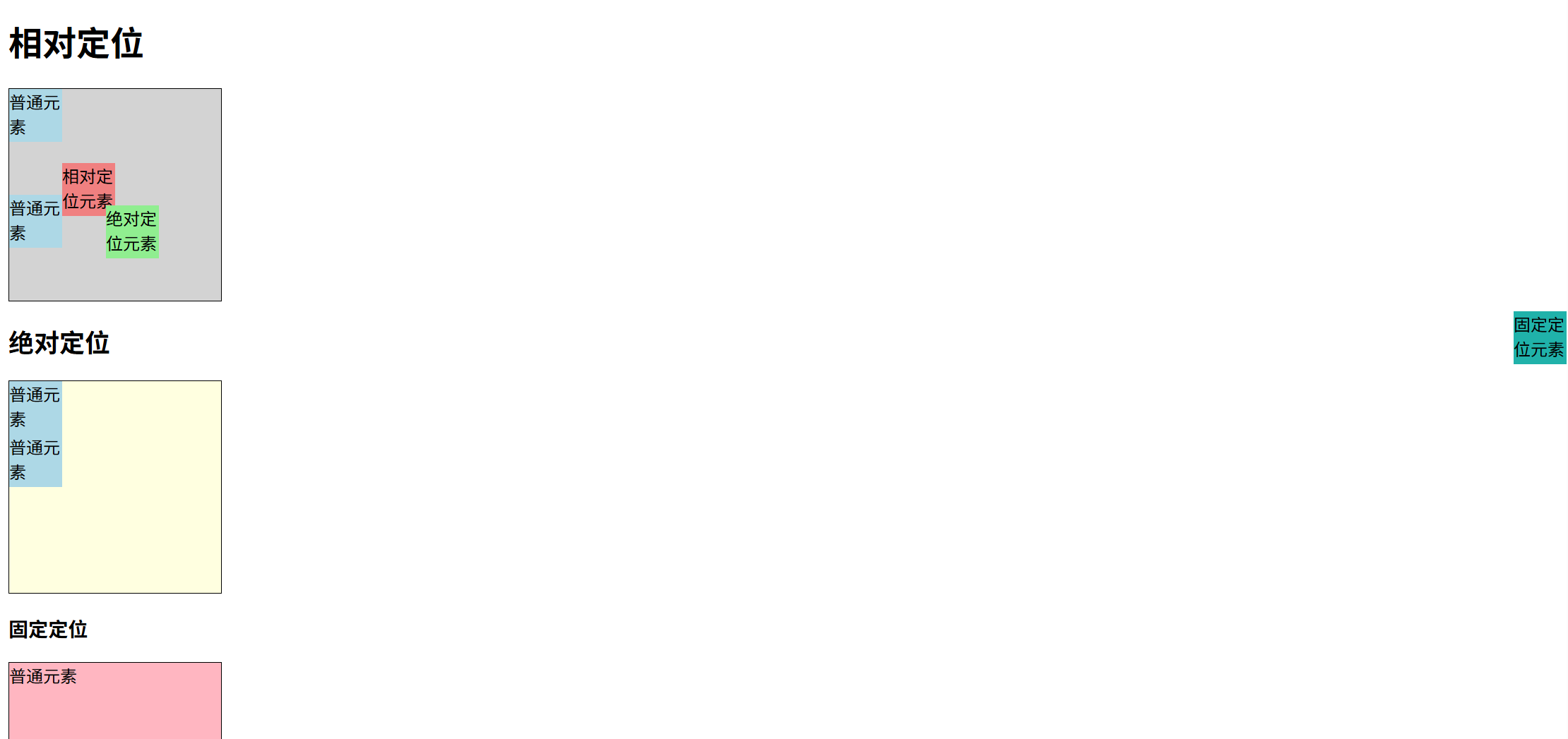
定位
| 定位类型 |
参考系 |
脱离文档流? |
relative (相对定位) |
自己原来的位置 |
❌ 不脱离 |
**absolute (绝对定位) |
最近的定位祖先 |
✅ 脱离 |
fixed (固定定位) |
浏览器视口 |
✅ 脱离 |
1
2
3
4
5
6
7
8
9
10
11
12
13
14
15
16
17
18
19
20
21
22
23
24
25
26
27
28
29
30
31
32
33
34
35
36
37
38
39
40
41
42
43
44
45
46
47
48
49
50
51
52
53
54
55
56
57
58
59
60
61
62
63
64
65
66
67
68
69
70
71
72
73
74
75
| <!DOCTYPE html>
<html lang="zh-CN">
<head>
<meta charset="UTF-8">
<meta name="viewport" content="width=device-width, initial-scale=1.0">
<title>定位</title>
<style>
.box-normal {
width:50px;
height:50px;
background-color: lightblue;
}
.box1 {
width: 200px;
height: 200px;
border: 1px solid black;
background-color: lightgray;
}
.box2 {
width: 200px;
height: 200px;
border: 1px solid black;
background-color: lightyellow;
}
.box3 {
width: 200px;
height: 200px;
border: 1px solid black;
background-color: lightpink;
margin-bottom: 100px;
}
.box-relative {
width:50px;
height:50px;
background-color: lightcoral;
position: relative;
top: 20px;
left: 50px;
}
.box-absolute {
width:50px;
height:50px;
background-color: lightgreen;
position: absolute;
left: 100px;
top: 200px;
}
.box-fixed {
width:50px;
height:50px;
background-color: lightseagreen;
position: fixed;
right: 0;
top: 300px;
}
</style>
</head>
<body>
<h1>相对定位</h1>
<div class="box1">
<div class="box-normal">普通元素</div>
<div class="box-relative">相对定位元素</div>
<div class="box-normal">普通元素</div>
</div>
<h2>绝对定位</h2>
<div class="box2">
<div class="box-normal">普通元素</div>
<div class="box-absolute">绝对定位元素</div>
<div class="box-normal">普通元素</div>
</div>
<h3>固定定位</h3>
<div class="box3">普通元素</div>
<div class="box-fixed">固定定位元素</div>
</body>
</html>
|
HTML和css混合
混搭的一个普通静态模型
[!IMPORTANT]
rgba 的语法格式是 rgba(R, G, B, A)。
R、G、B (红、绿、蓝)
- 这三个参数用来决定具体的颜色。
- 它们的取值范围都是 0 到 255 之间的整数。
0 表示该颜色通道“关闭”(没有这种颜色的光)。255 表示该颜色通道“开到最大”(该颜色的光最强)
A (Alpha - 透明度)
- 这是
rgba 最关键的部分,它用来控制颜色的不透明度。
- 它的取值范围是 0.0 到 1.0 之间的小数。
1.0: 完全不透明 (默认值,颜色是实心的)。0.0: 完全透明 (颜色完全看不见)。0.5: 半透明 (50% 的不透明度)。- 数值越小,颜色就越透明,越能看清它后面的内容。
1
2
3
4
5
6
7
8
9
10
11
12
13
14
15
16
17
18
19
20
21
22
23
24
25
26
27
28
29
30
31
32
33
34
35
36
37
| <!DOCTYPE html>
<html>
<head>
<meta charset="utf-8" />
<title>实验一</title>
<link rel="stylesheet" href="StyleSheet1.css" >
</head>
<body>
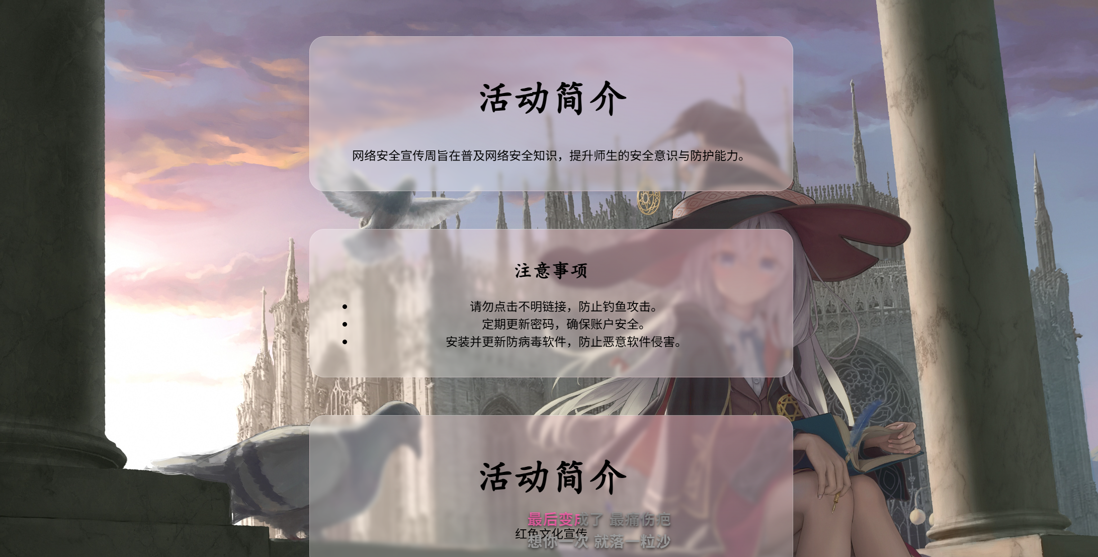
<div class="card">
<h1>活动简介</h1>
<p>网络安全宣传周旨在普及网络安全知识,提升师生的安全意识与防护能力。</p>
</div>
<div class="card">
<h2>注意事项</h2>
<ul>
<li>请勿点击不明链接,防止钓鱼攻击。</li>
<li>定期更新密码,确保账户安全。</li>
<li>安装并更新防病毒软件,防止恶意软件侵害。</li>
</ul>
</div>
<div class="card">
<h1>活动简介</h1>
<p>红色文化宣传</p>
</div>
<div class="card">
<h2>学习总结</h2>
<ol>
<li>学习中国共产党的历史:梳理不同时期的奋斗历程、重大事件、重要会议与英雄人物,理解历史脉络与精神谱系</li>
<li>探索理论成果:系统学习马克思主义基本原理及其中国化时代化成果</li>
<li>不忘记曾经的艰难,不忘记原本的生活</li>
</ol>
</div>
</body>
</html>
|
1
2
3
4
5
6
7
8
9
10
11
12
13
14
15
16
17
18
19
20
21
22
23
24
25
26
27
28
29
30
31
32
33
34
35
36
37
38
39
40
41
42
43
44
45
46
47
48
49
50
51
52
53
| h1 {
font-size: 50px;
font-family: KaiTi;
}
h2 {
font-size: 25px;
font-family: KaiTi;
}
.card {
text-align: center;
width: 600px;
border: 1px solid rgba(255, 255, 255, 0.25);
border-radius: 20px;
padding: 20px;
margin: auto;
margin-top: 50px;
box-shadow: 0 8px 32px rgba(97, 115, 150, 0.1);
background: radial-gradient( 1200px 600px at 80% -10%,rgba(255, 192, 203, 0.5) 0%, rgba(255, 255, 255, 0.3) 40% );
backdrop-filter: blur(3px);
}
body {
background-image: url('elaina.jpg');
background-position: center center;
background-repeat: no-repeat;
background-size: cover;
}
|